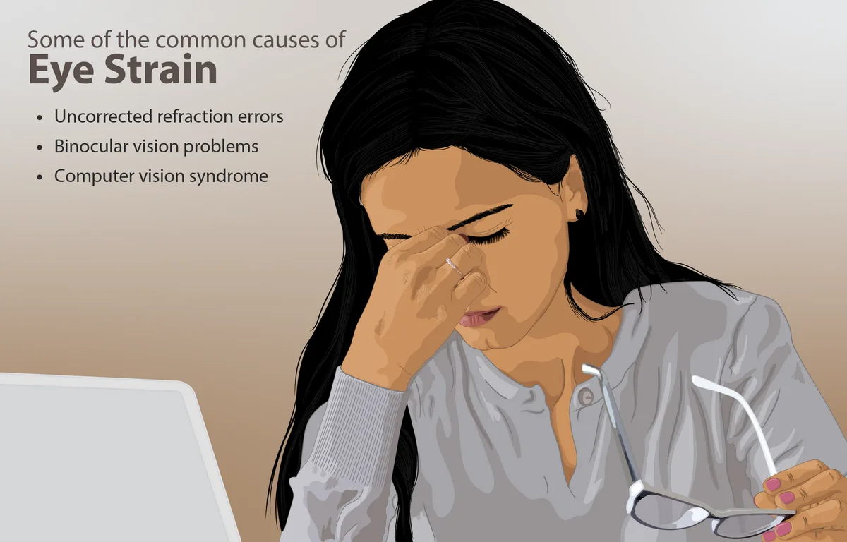
At its simplest, reading means looking carefully at written words to understand them — that is how Dictionary.com defines the verb — and everything that tires you out in an e-book session comes from how hard that looking becomes. Eye strain is the usual culprit. It shows up as sore, dry, or watery eyes, a dull headache, or a vague sense that the page has gone blurry after an hour. The good news: almost every cause of it is a setting you can change, a habit you can adjust, or a chair you can move.
This guide walks through the adjustments that matter most, whether you read on an E Ink e-reader or a phone or tablet with an LCD screen. None of it requires new hardware. Most of it takes less than five minutes to set up once, and then it just works in the background of every session after that.
What actually causes eye strain when reading digitally?
Eye strain during digital reading is usually a mix of four things: small or cramped text, a screen that is much brighter or dimmer than the room, glare on the screen surface, and holding your eyes in one focus position for a long stretch without a break. It is a comfort problem, not an injury in most cases, and it improves quickly once you remove the causes. This connects to our earlier piece, What the European Book Market Report Says About Digital Reading.
E Ink readers have an advantage here. The page reflects light the way paper does, so there is no flicker and no glow from the background. But E Ink is not automatically comfortable — a dim front light in a dark room, a tiny font, or a stubborn glare from a window can still wear you down. LCD screens add one more factor: the light comes from behind the text, which many readers find more tiring over long sessions, especially at night.
Our analysis of what readers report most often points to brightness mismatch as the number-one fixable issue. If the screen glows brighter than the wall behind it, your eyes work harder. Match the screen to the room and most of the strain tends to fade.
Which screen settings matter most?
Start with brightness. On an E Ink reader, turn the front light down to the lowest level where you can still read comfortably in your current lighting. In daylight, you often need no light at all. On an LCD device, aim for a screen that blends into its surroundings rather than standing out as the brightest object in view.
Next, warm light. Most modern e-readers and many reading apps offer a warm-light setting that shifts the screen's color toward amber. Readers who read before bed often find warm light gentler on the eyes, and it may interfere less with sleepiness than a cool blue-white glow. If your device has an automatic schedule, set it to warm up in the evening and cool down in the morning.
Font size deserves more credit than it gets. If you catch yourself leaning toward the screen or squinting, the text is too small — bump it up a size or two and let the page reflow. The same goes for line spacing and margins: a little extra breathing room around a paragraph reduces the effort of tracking from one line to the next. Serif and sans-serif both work fine on E Ink at adequate sizes, so pick the typeface that looks cleanest to you rather than assuming one family is objectively easier.
Dark mode splits opinion. On LCD devices, white text on a black background can feel easier at night and reduces overall light output. On some E Ink panels, dark mode can look slightly grainy because of how the display renders inverted pages, so try it briefly before committing. If you are weighing device choices in the first place, our guide to e-readers covers how screen types differ.
How should you tune brightness and warm light across the day?
The honest answer: by the room, not by the clock. A screen setting that feels perfect in a bright kitchen at noon will feel harsh in a dim bedroom at ten at night. The practical approach is to adjust brightness every time the lighting around you changes meaningfully, rather than leaving it fixed.
A simple routine many readers settle into:
- Daylight, indoors: front light off or near-zero on E Ink; low brightness on LCD.
- Evening, lamps on: front light just high enough to read; warm light on, moderately strong.
- Reading in the dark with no other light: the dimmest workable setting, warm light at its strongest — though a small lamp nearby is often easier on the eyes than a lone glowing screen.
If your reader or app supports automatic adjustment by time of day, use it as a starting point and then override it when a room calls for something different. The goal is always the same: a page that neither glows nor strains.
How often should you take breaks — and what should you do during them?
Long, unbroken focus is the quiet culprit behind most reading fatigue. Eye-care professionals commonly recommend periodic breaks from near-focus work, and while the exact timing varies by source and by person, the underlying principle is consistent: give your eyes a change of distance and a chance to blink.
A workable habit is to pause at natural milestones — the end of a chapter, the end of a section — and look at something far away for a little while. Distance relaxes the focusing muscles that near work keeps contracted. Blink deliberately a few times, too; people blink far less when absorbed in a screen, and dry eyes follow. Standing up and moving around for a minute or two helps your neck and shoulders as much as your eyes.
If you find that you regularly lose track of time while reading, some devices and apps include break reminders or session timers. Turning one on is a low-effort way to build the habit without watching the clock. For a broader look at what research says about screens and reading behavior, see our piece on what the newest reading-habits data says about screens.
What does posture have to do with tired eyes?
More than most readers expect. Slouching or craning forward changes the distance and angle of the screen, which quietly forces your eyes to work harder. A hunched neck also contributes to the headaches people often blame entirely on the screen.
The comfortable baseline is simple to describe. Sit upright with your back supported, and hold the book or device far enough away that you are not leaning toward it — roughly the distance at which your arm is slightly bent, not fully extended. Raise the screen toward your eyes rather than dropping your head toward the screen; a pillow on your lap, a stand, or a book rest all do the job. In bed, avoid reading flat on your back with the screen hovering above your face at arm's length — the angle is awkward for both neck and eyes, and one arm eventually tires and shortens the viewing distance.
Practical steps worth adopting:
- Set brightness and warm light to match the room before you start.
- Choose a font size you can read without leaning in.
- Position the screen so your neck stays neutral — screen up, head level.
- Pause at chapter breaks to look at something distant and blink.
- Stop when discomfort appears rather than pushing through it; strain that lingers into the next day is a signal to adjust, not endure.
Our take: comfort is a setup problem, not a device problem
The evidence and the everyday experience of long-session readers point the same direction: most digital reading fatigue comes from fixable conditions, not from screens being inherently hostile to reading. An E Ink reader with a well-tuned front light and a sensible font is a genuinely comfortable long-session device, and an LCD tablet with matched brightness, warm light, and honest breaks can be nearly as easy. The differences between them are real but smaller than the difference between a tuned setup and a neglected one.
What the available material does not establish is a single universal prescription — the right brightness, font size, and break rhythm vary with your eyes, your lighting, and the length of your sessions. Treat the settings above as a starting point, adjust by feel, and if persistent discomfort survives every adjustment, that is a question for an eye-care professional rather than another settings menu. And if accessibility needs are part of your reading life, our accessibility coverage goes deeper into the features built for exactly those situations.